Product, Design
Author:
Michael Wilson
Date:

“Graphics are not just decoration—they are instruments for reasoning.”
-Alberto Cairo, author of The Functional Art, an introduction to information graphics and visualization.
Introduction
Designing for modern cybersecurity platforms in the age of AI and in an increasingly discerning market requires data to be understood quickly, in appropriate context, and be actionable with clear indicators of priority. At Good Code we believe critical data should tell a story that illustrates a deeper understanding of the product and quickly surfaces its value. This story can shift however based on the size or the stage of a cybersecurity organization or product. Small customers need clarity and speed while large customers want depth and control. We must curate each story based on all these factors and the changing landscape.
Writing the Story
Writing the story begins by surfacing the key solutions and insights from the product through the data and its surrounding context. Formatting this information in a way that is understandable, informative, and actionable is key to a visualization that enriches the product’s offering, satisfies the customers’ needs, and is not just seen as a pretty picture.
Once this key information is determined, the most effective data points for telling our story are isolated and exploration begins for illustrating this data in the most understandable and actionable format. It’s at this point we want to determine what are the best types of visualizations to convey this story. There are a series of questions we can ask to help in this selection:
What is the purpose of this visualization?
Does the user need to see a trend, comparison, or a more complicated relationship?
Does the user need to explore the data deeper through this visualization?
Is time a necessary factor to effectively tell the story of this data? If so, what are the key time frames needed or are they customizable?
How many variables and/or dimensions need to be visualized? Is this data hierarchical?
Will this visualization be interactive and to what degree? Will the user need to change state or can all the states be presented in this space?
Finally, and most importantly, who is the audience for this and what is their level of data literacy? How much explanation, context, or annotation will the user need? Sometimes many levels of sophistication must be taken into consideration.
The answers to these questions will give you a short list of visualization types to start the design. Remember, throughout this process, user and stakeholder feedback is critical to validate the visualization and to insure it delivers value for the complete range of users.
Designing for the Ends of the Spectrum
Depending on the stage of the product or the types of customers targeted, these visualizations need to satisfy a range of the user spectrum. This can be challenging as typically smaller customers need fast comprehension of their security situation, simple summaries, and the ability to get up to speed with little to no training. This is in contrast with the needs of larger customers that require deeper insight, investigations with rich drill downs, overall trends, and correlation with multiple tools. These customers will usually require integrations, custom dashboards and multi-tenant contexts.
Satisfying this wide spectrum of user needs requires visualizations that immediately surface critical items and comprehensive summaries of a customer’s situation while empowering expert users to drill down into the surrounding data and context. Critical items should be highly visible and contrasted against the rest of the graph through size, color, etc. so they are immediately recognized by the user. If space allows the design of these critical items should also convey their severity so the user can quickly prioritize what needs their attention first. More sophisticated users should be able to quickly access key contextual data of these items through either a simple interaction or investigation. If this requires additional screens make sure to carry the initial items and key context through to the new screens to help reduce cognitive load.
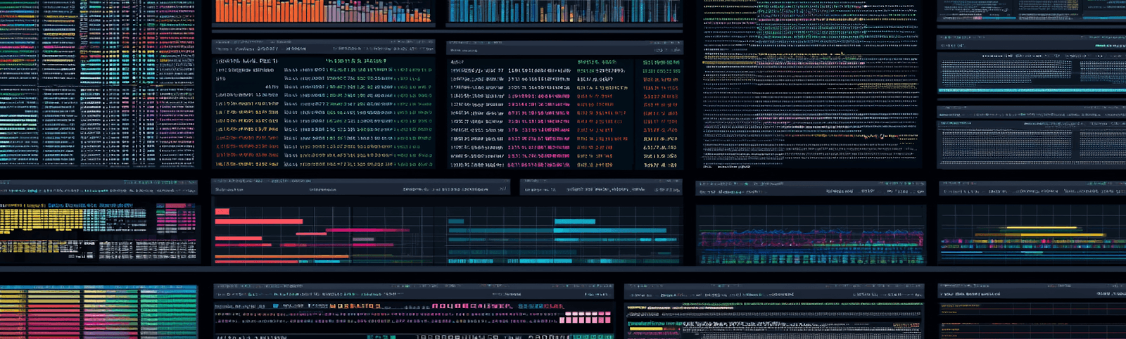
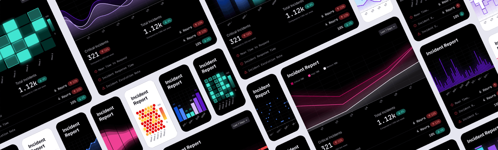
Design Patterns that Scale
With a constantly evolving product and, ideally, a constantly expanding customer base, designing for these moving targets can be tricky. This is where the power of a vetted, well-constructed design system and visualization library come into play. These systems should contain examples of standard data visualizations with clear indexes and metrics ideally with color and typography tied to the overall design system for consistency. This allows for a rapid exploration of solutions that empower the designer to focus on the overall experience without getting bogged down in the details of each visualization. The focus remains on building the story while iterating through potential solutions for each customer type. These solutions can then focus on providing quick comprehension and priority actions while assisting investigations and deeper dives into the context satisfying more user needs. Once the overall story and key solutions are determined the overall design can be further refined and details refined as needed.
Conclusion: A Scalable Design is a Strategic Advantage
By focusing on the overall story of the data at the beginning, multiple solutions at different fidelities can be explored to satisfy the largest possible group of users. Leveraging a well constructed design and visualization library empowers this exploration through rapid development in the beginning while expanding for more detailed deep investigations as needed. Time saved leveraging these systems allows for more input from stakeholders and the market and coordination with development early on.
If you’d like to learn more please reach out to us at Good Code where we’d be happy to discuss our process and the tools that power our and our customers’ success.


