Product, Design
Author:
Lisa Riabova
Date:

Intro
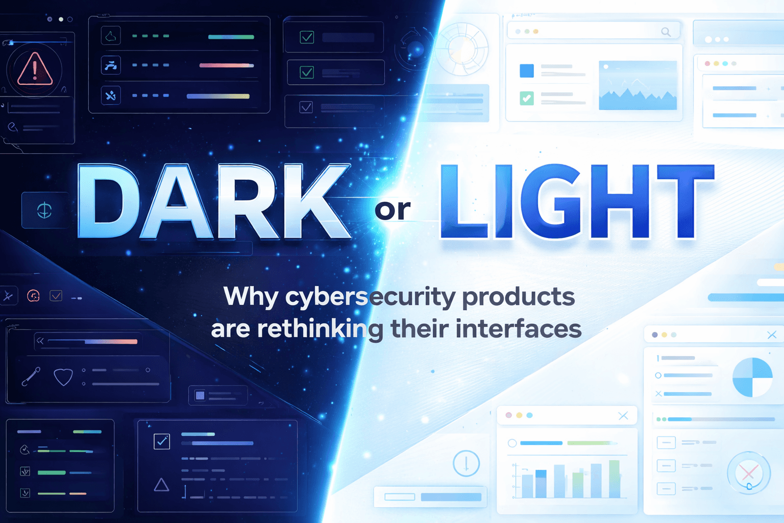
Cybersecurity tools have a reputation. Dark screens, a lot of information, and an interface that clearly says: this is not a toy. Many teams like it that way.
But lately, something interesting has been happening. Some cybersecurity products are starting to introduce light mode or lighter color themes alongside the classic dark look. Not a full visual reset, and definitely not everywhere - but enough to make people notice. And yes, enough to spark debates.
This is not a manifesto for light mode. Many teams still prefer dark interfaces, and many from our team do too. What is changing is the context: who uses these tools, how often they use them, and what kind of work they need to do day after day.
In this article, we explore where the dark pattern came from, why light mode is showing up more often, what is driving that shift, and what it might mean for cybersecurity product teams - without declaring a winner.
Where the “dark” pattern came from and why it’s so usual for cyber security
That look did not appear by accident. It grew out of how security work actually happens. Not in short, calm sessions, but during long shifts, late nights, and on-call rotations, when people are tired and still need to stay sharp.
In those conditions, dark color schemes make a lot of sense. They reduce glare, make dense information easier to look at for long periods, and generally feel less exhausting. When someone is watching alerts, digging into an issue, or trying to understand what just happened, visual comfort becomes part of getting the job done.
Over time, dark interfaces simply proved dependable. They helped important things stand out and made busy screens easier to live with. For people working overnight or switching between shifts, that consistency mattered.
There is also a familiarity factor. Dark mode became a visual signal that a tool was serious and built for real security work. Teams learned how to read it. New products followed patterns users already trusted - not because anyone lacked ideas, but because those patterns worked.
What “light side” actually means
When people talk about the “light side” of cybersecurity products, they are often literally talking about light mode - brighter backgrounds, higher contrast text, and a more traditional, document-like look.
Light mode changes how information is read. Screens feel more open. Text and tables can be easier to scan, especially in well-lit environments or during short sessions. For users who are checking status, reviewing reports, or explaining something to others, light mode can feel more familiar and less heavy.
Dark mode, on the other hand, tends to work better for long sessions and continuous focus. Light mode often works better for quick reading, comparison, and communication. Neither is inherently better - they support different ways of working.
As more people interact with security tools, the ability to switch between these modes becomes more important. What feels comfortable for an analyst on a night shift may feel hard to read for a manager looking at a report in the middle of the day.
What’s driving the shift
The growing presence of light mode is not about replacing dark mode. In many cases, dark is still the better choice - especially for long shifts, night work, and continuous monitoring.
What has changed is who needs to use these products.
Security tools are no longer used only by analysts working full shifts inside them. Today, many more people need access: IT teams, engineers, managers, leadership, compliance, and sometimes non-technical roles. These users are not living in the product all day. They open it briefly, look for answers, and move on.
For these moments, dark and dense interfaces can be harder to read quickly. Light mode makes information easier to consume, easier to explain, and easier to share - especially when the goal is understanding rather than reacting.
Usage patterns have changed as well. Security tools are used more often outside of incidents - to check status, review trends, prepare reports, or communicate context. When everything looks dark and intense all the time, it becomes harder to tell what actually matters.
Light mode also helps with this. When the default view is calmer and more neutral, real emergencies can stand out more clearly through color, contrast, and alerts.
This is why many products now support both. Dark mode for monitoring and long sessions. Light mode for investigation, reporting, collaboration, and overview. Each supports a different kind of work.
What this means for cybersecurity product teams
For product teams, this means thinking less about preference and more about usage.
Who is opening this screen? For how long? Is this a quick check, a long shift, or a conversation with someone outside the security team? Is the goal to detect something, investigate it, or explain it to someone else?
In practice, choosing between dark mode and light mode often comes down to a few signals:
How long users stay in the product
Whether urgency is constant or occasional
How many different roles need to read the same screens
Whether the goal is detection, investigation, or communication
There is no single right answer. The strongest products give users the right visual tools for the job they are doing.
At Good Code, this is how we approach these decisions. We start by understanding how a product is actually used - not how it is described. We look at workflows, session length, user roles, and moments of stress versus routine. Only then do we explore how dark and light modes should be applied.
If you are unsure which direction makes sense for your product, that is exactly what we help teams figure out at Good Code.
We may prefer dark - but we prefer the right decision even more 😉


